Start with the safest answer: combine clues, do not chase one feature
If you want to identify a stamp’s printing family safely, begin with a methodical comparison of several clues rather than one dramatic visual effect. The main families named by the American Philatelic Society are line-engraved intaglio, gravure, letterpress, and lithography. On modern issues, more than one process may appear on the same stamp, so the goal is to build a cumulative case, not to force a quick label from a single mark.
That approach matters because some visual effects can overlap. Raised-looking ink, screened dots, sharp edges, or texture can appear in more than one process, and lighting can change what you think you see. Use non-contact magnification and diffuse or oblique light, then compare what you observe with production records when they are available. StampSnap can help you keep a likely identification and notes together as a collection record, but it should not be treated as a final technical verdict.
What line-engraved intaglio usually leaves behind
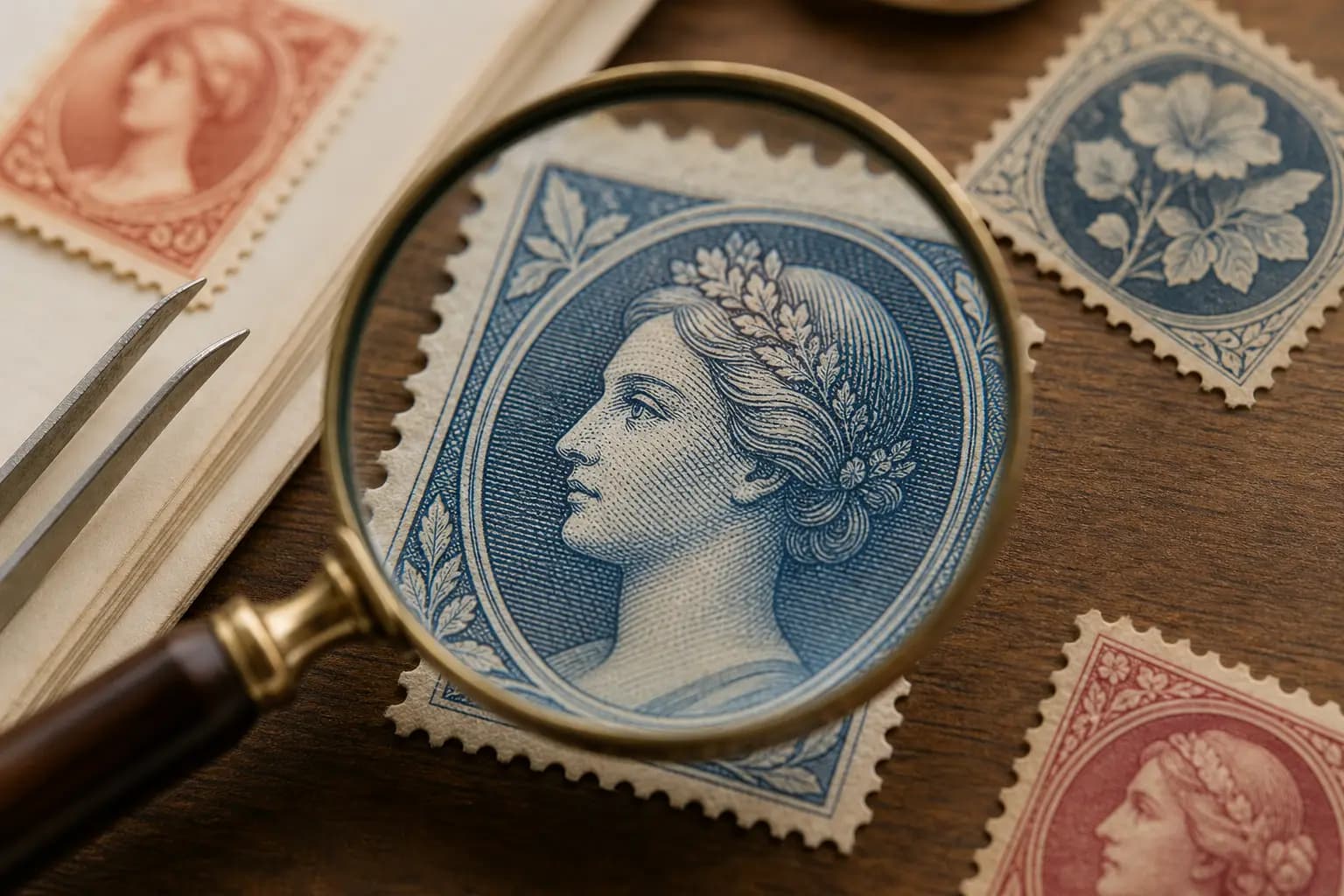
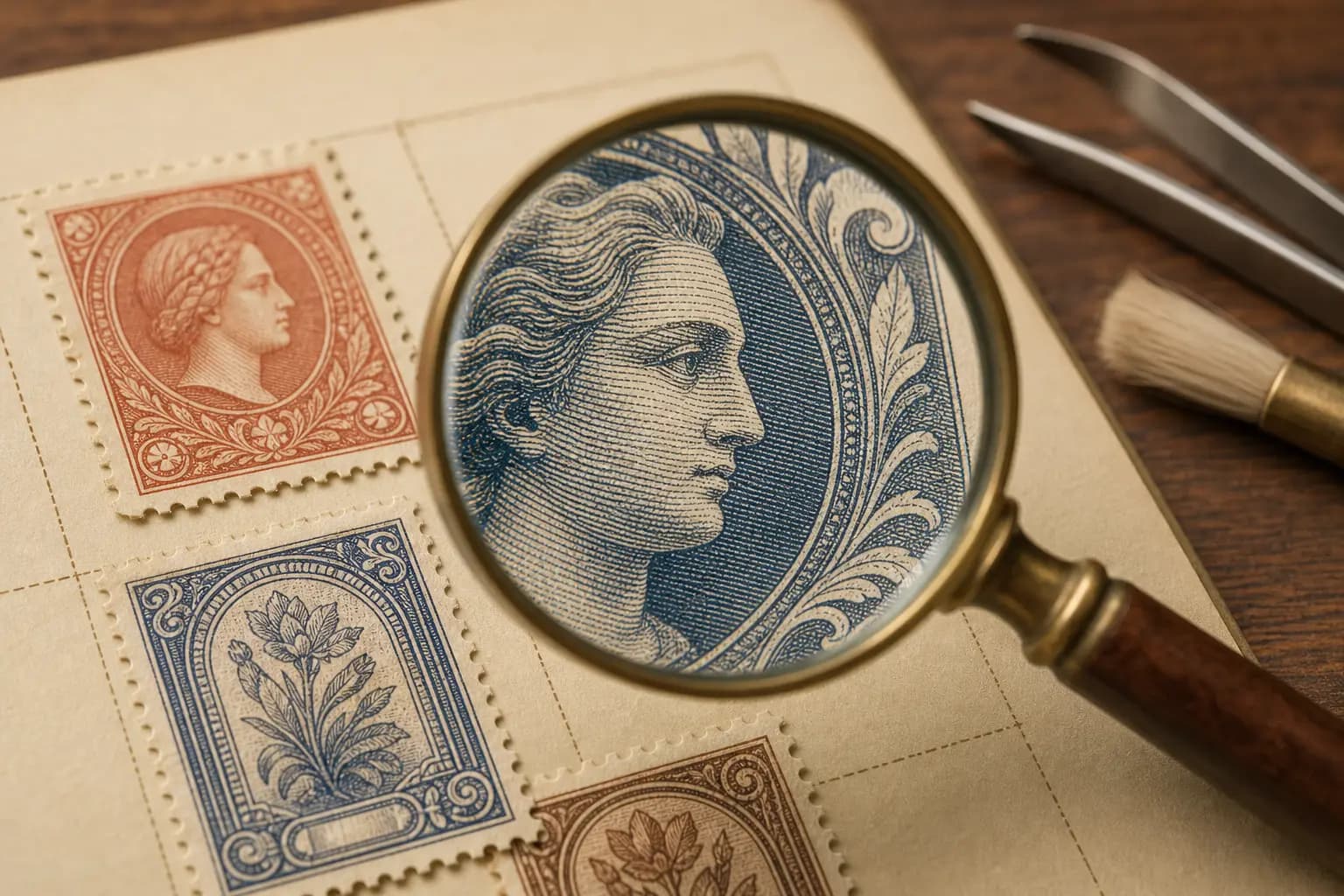
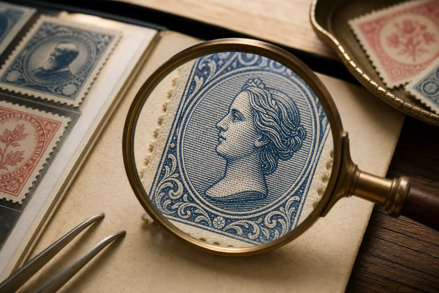
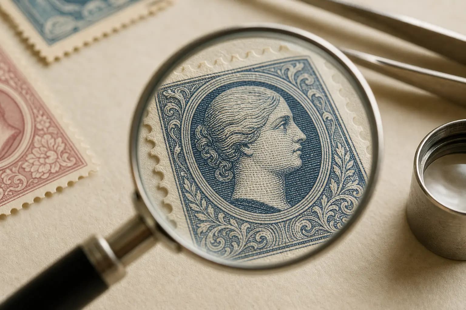
Line-engraved intaglio is the family most associated with ink transferred from deliberately incised lines. Its design is normally built from lines, hatching, cross-hatching, and stippling rather than flat fills. Under magnification, you may sometimes see raised ink, and oblique light can make that surface character easier to notice. Pressure may also leave debossing on the reverse, but that is a supporting feature, not a standalone test.
For safe identification, look for consistency across the whole design. If the image is mainly made from fine engraved linework, the stamp has a stronger intaglio profile than a design that relies on uniform tone or dot screens. Even then, do not stop at one clue. The APS guidance is clear that raised ink and reverse debossing are supporting features rather than single tests, so they should be weighed alongside the printed structure and the source information for the issue.
How gravure differs from intaglio in practice
Gravure is also a recess process, so it can seem close to line-engraved intaglio at first glance. The important distinction in the supplied evidence is that gravure forms tone from screened cells rather than from deliberately incised linework. That means the printed image may look more tonal or cell-based under magnification, but you still need to interpret the result carefully and in context.
Do not identify gravure from screened or raised effects alone. The source evidence specifically warns that screened or raised effects can appear in other processes as well. A safer method is to compare the structure of the design, the kind of tone pattern you see, and any production notes that describe how the issue was made. When a stamp seems ambiguous, record it as a probable family and revisit it after comparing the issue against authoritative references.
Why lithography is a different kind of printing clue
Offset lithography is a planographic process, which means the image is formed on a smooth surface rather than cut or etched into a plate. In the Smithsonian National Postal Museum’s description, oil-based ink adheres to the image area and a rubber blanket transfers, or offsets, that image to paper. That transfer route is the key idea to keep in mind when you compare lithography with recess or relief processes.
Modern stamp lithography often combines separate process-color layers made from very fine dots. Those dots can be visible under magnification, but the Museum cautions that a dot pattern must be interpreted with other evidence because gravure and other processes can also show screened structures. Equally important, modern lithography can be sharp, so soft or blurred edges are not a dependable identifying rule. This is why a careful collector looks at layout, dot behavior, and issue records together rather than chasing one visual shortcut.
Letterpress can be present, but it is not always obvious
Letterpress belongs among the four major families used for postage stamps, even if it is less discussed than the others. Because the source evidence does not give a single simple visual test for letterpress, the safest approach is to treat it as a family identified by cumulative comparison with known examples and production records. If a stamp does not fit the line-engraved intaglio, gravure, or lithography patterns you have observed, letterpress may be part of the answer, but only after a broader check.
This is especially important on modern issues where multiple processes may appear together. A single stamp can combine printed elements in ways that blur easy visual sorting. That is why a clean workflow matters: inspect under non-contact magnification, note the dominant structures, compare with issue documentation, and keep your notes consistent. If you manage your own reference files in an app or album log, StampSnap can be useful for storing those observations as part of a likely identification, not as a guarantee.
Use records to confirm what the eyes can only suggest
Production records are the safest way to resolve uncertainty when visual clues overlap. The APS source explicitly recommends combining observations with production records, especially because more than one process may appear on a modern stamp. This is the point where careful collecting becomes real research: the stamp on the page is compared with what the issue was actually recorded as being.
Good records can also protect you from over-reading a pattern. A design that looks softly printed may still be sharp lithography, and a screened look may belong to gravure or another process. When records and observations agree, your identification becomes much more dependable. When they disagree, keep the uncertainty in your notes and continue comparing examples rather than forcing a conclusion.
A safe, repeatable workflow for collectors
Begin by handling the stamp as little as possible and avoid any contact methods that could damage the surface. Use non-contact magnification first, then diffuse or oblique light to study line structure, dot structure, and any possible debossing or ink relief. Move from the widest visual pattern to the smallest, and write down exactly what you see before checking a catalogue, handbook, or production note.
Next, ask four questions in order: does the design look line-engraved intaglio, does it show gravure-style screened cells, does it fit offset lithography with fine process-color dots, or does the evidence point elsewhere such as letterpress? If the answer is mixed, keep the record mixed. The most reliable collectors are not the fastest ones; they are the ones who preserve evidence, compare examples, and accept uncertainty until records settle it.
Frequently asked questions
Can I identify a stamp printing method from dots alone?
No. Dot patterns must be interpreted with other evidence because gravure and other processes can also show screened structures.
Are soft or blurred edges a reliable sign of lithography?
No. The Smithsonian National Postal Museum notes that modern lithography can be sharp, so softness or blur is not a dependable identifying rule.
What is the safest way to study printing clues?
Use non-contact magnification with diffuse or oblique light, and combine what you see with production records whenever possible.
Can one modern stamp show more than one printing process?
Yes. The American Philatelic Society states that more than one process may appear on a modern stamp.
Should I treat raised ink or reverse debossing as proof of intaglio?
No. These are supporting features, not single tests, and they should be weighed with the rest of the evidence.